

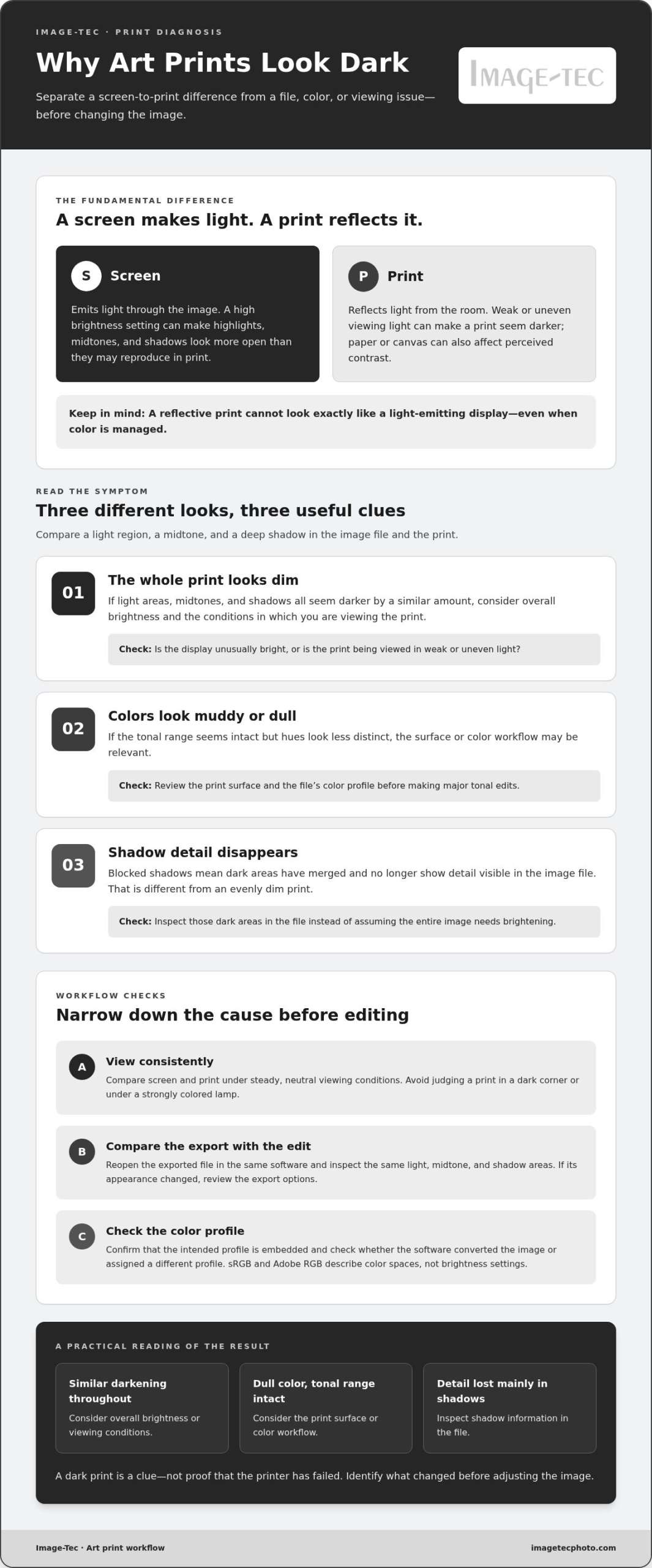
What if your printer isn’t the problem? If you’re asking, “why are my art prints coming out dark,” the difference may begin before the file reaches the printer. A bright screen emits light, while paper reflects the light around it, so an image that looks vivid on display can lose brightness and shadow detail in print.
It’s frustrating to see a carefully edited image come out dull, especially when you’re not sure whether the cause is your monitor, image file, paper, or print settings. The good news is that a dark result is often a workflow mismatch, not a reason to keep making costly test prints.
This guide explains how screen brightness, color space and profiles, soft proofing, paper choice, and viewing conditions affect the final appearance. You’ll learn what to check before reprinting and how to narrow down the likely cause. For artwork that needs careful capture or reproduction, professional scanning and Giclée printing can also help bring each stage of the process into closer alignment.
Key Takeaways
- If you’re wondering “why are my art prints coming out dark,” compare the print with the image file, not only with a bright screen preview.
- Check whether the whole image is darker or whether shadow detail is blocked; the difference can point to different causes.
- Assess prints under consistent viewing light before changing brightness or ordering another copy.
- Adjust the specific issue you identify, and consider how paper or canvas can affect perceived contrast.
- When file adjustments don’t resolve a capture-to-print mismatch, BetterLight scanning and Giclée printing can support a more considered reproduction workflow.
Why are my art prints coming out dark? Start with the screen-to-print difference
A print that looks dimmer than the image you edited can be disappointing, particularly when you recognize the artwork but lose the luminous quality you saw on screen. If you’re asking, “why are my art prints coming out dark,” start by comparing how you view each one. A monitor creates light with its display, while paper and canvas reflect light from the room. That basic difference affects perceived brightness before you consider the file or printing process.
A screen shines light through an image; a print can only reflect the light falling on its surface. Bright areas on a display can therefore seem more vivid than the same areas on a print. The room matters too: a screen viewed in a dim space may appear especially luminous, while a print examined under weak or uneven light can seem darker than it would in brighter, consistent conditions.
The result isn’t determined by one factor alone. Display settings, image data, print surface, and viewing light can combine to change how brightness, color, and detail appear. Color management describes the methods used to keep color reproduction more consistent across devices, but even a managed workflow doesn’t make a reflective print behave like a light-emitting screen.
Why the same artwork looks brighter on a screen
A display’s backlighting makes luminous areas appear to glow, especially in highlights and saturated colors. If the brightness setting is high, the image can look brighter than the file would suggest when reproduced on paper. Your surroundings also influence the comparison: a bright room can make a screen seem less luminous, while a dark room can exaggerate its glow. A screen without consistent calibration is a reference, not a promise of an exact print match.
That difference is useful to keep in mind before changing the image. A file that looks balanced on a bright monitor may not contain the brightness you expect once it is printed. Conversely, increasing brightness based only on a print viewed in poor light can lead to an image that looks washed out in other conditions.
What “dark” can mean in a finished art print
Describe the symptom before deciding what caused it. An overall dim print may have a similar appearance across highlights, midtones, and shadows. Muddy color can make hues seem dull or less distinct, while blocked shadows mean darker areas have merged and no longer show the detail visible in the image file. These are different problems, and a blanket brightness increase may not address each one.
Compare a few familiar areas between the file and print: a light region, a midtone, and a deep shadow. If all appear darker by a similar amount, the overall brightness or viewing conditions may be influencing your impression. If color looks dull but the tonal range seems intact, the surface or color workflow may be relevant. If fine details disappear specifically in dark areas, inspect those shadows in the file rather than assuming the whole image needs brightening. One dark print doesn’t automatically prove the printer has failed; it’s a clue to examine how the image was displayed, prepared, and viewed.
How display settings, image files, and color management affect print brightness
A print can look dark even when the image seemed ready on screen because the display may be showing a brighter version than the file will reproduce. A bright monitor can hide a file that will print dark by making its midtones and shadows look more open than they really are. If you compensate by editing against that overly luminous preview, the saved image may end up darker than intended.
Color management helps devices interpret color and tone more consistently. An ICC profile is a small set of instructions describing how a device or file represents color. A profile mismatch, or a file with no embedded profile, can cause editing software to interpret the image differently. This may change color and contrast, so check the file’s profile before making major tonal edits.
Check monitor brightness and room lighting before editing
Set your display to a comfortable, consistent brightness rather than judging the image with the screen turned up high. There’s no universal brightness setting that suits every screen and room, but avoiding an unusually bright display reduces the risk of editing to an unrealistic preview. Keep room lighting steady as well. Strong ambient light can wash out a screen, while a dim room can make it seem unusually bright by comparison.
For a useful comparison, look at the screen and print under steady, neutral viewing conditions. Avoid judging the print in a dark corner or under a strongly colored lamp, since that can distort your impression of brightness and color. A more consistent viewing setup won’t make the two media identical, but it can help you decide whether the difference is in the file or the viewing conditions.
Check color profiles and the exported image file
Before changing the image, compare the exported file with the edited version in the same software. Reopen the export and inspect the same light, midtone, and shadow areas. If the appearance changes after export, review the export options and confirm that the intended profile is embedded. Also check whether the software converted the image to another profile or simply assigned a different one. Conversion adjusts color values to preserve appearance as far as possible; assigning a profile changes how existing values are interpreted.
sRGB and Adobe RGB are color-space names, not brightness settings. A color space defines a range of colors that can be represented; neither profile automatically makes a print lighter or more accurate. The appropriate choice depends on the file, editing workflow, and print process. Avoid switching profiles at random to brighten an image. Instead, keep track of which profile is embedded and use the relevant printer profile when available to preview how the print may reproduce.
If an original artwork’s capture is the source of persistent color or tonal inconsistencies, BetterLight scanning and Giclée printing can form part of a considered reproduction workflow, from creating a high-resolution digital file to producing the print.
How to diagnose a dark art print without guessing at the cause
Before changing brightness or ordering another print, trace where the image first begins to look different. A simple comparison can help separate a file or export issue from a print or viewing-condition difference. If you’re asking “why are my art prints coming out dark,” focus on the pattern: is the whole image dimmer, or are only certain tones or details affected?
- Inspect the working file and export. Open both in the same software and compare them on the same display. If the export already looks darker, investigate what happened during export before changing the print settings.
- Compare specific tones. Look at a light area, a midtone, and a deep shadow. Note whether color has shifted, contrast feels weak, or shadow detail has disappeared.
- Standardize the viewing conditions. View the print under even, neutral light rather than comparing it with a bright display in a dark room. Give your eyes time to adjust.
- Choose the next check. Use the symptom to decide whether to review the file, export, viewing light, or print workflow. Avoid repeatedly brightening the entire image without identifying the mismatch.
Compare the original file, export, and printed result
Keep the original file unchanged. If you need to test an adjustment, save a separate version so you can return to the source and compare changes. Check whether the export differs from the working image, then assess the print against the export. Pay attention to shadow separation, midtone depth, and color, not just whether the overall result looks brighter or darker.
A small note helps: record which areas differ and whether the change appears in the export or only in the print. That makes the next adjustment more deliberate.
| What you observe | Workflow area to inspect |
|---|---|
| The entire print looks dimmer | Display brightness, viewing light, and overall file tone |
| Dark areas merge or lose detail | Shadow detail in the file and how it reproduces |
| Color looks dull or shifted | Export settings, embedded profile, and print surface |
| The export looks darker than the working file | Export or color-profile handling |
Judge the print under consistent viewing conditions
Don’t compare a backlit screen in darkness with a print under dim or colored room light. Place the print in even light, view the display nearby at a comfortable setting, and allow your eyes to adjust before judging. Record whether the difference affects the whole image or mainly highlights, midtones, shadows, or color. This observation helps narrow the cause without treating every dark-looking print as the same problem.
If the whole image is consistently darker, investigate overall brightness and viewing conditions first. If only the deepest tones have lost separation, a global brightness increase may wash out the rest of the artwork without restoring shadow detail. Diagnose first, then adjust only the part of the workflow the comparison points to.
What to adjust before you order another art print
Once you’ve identified where the mismatch appears, make a targeted change rather than raising brightness across the entire image. If the whole file looks balanced but the deepest tones lose detail in print, a global adjustment may wash out highlights and midtones without fixing the shadows. If the export itself looks different, revisit its settings before editing the artwork. A precise diagnosis helps avoid repeating the same result.
Make measured edits instead of brightening everything
Preserve the original file and work on a duplicate. Note each adjustment, such as lifting shadow detail or gently changing midtones, so you can compare versions and reverse a change if it weakens the image. Export the revised file using the intended workflow, then review it under the same display and lighting conditions as before. Change one thing at a time; otherwise, it’s harder to tell which adjustment helped.
For example, if dark areas have merged but the rest of the image matches your intent, focus on those shadows rather than increasing exposure across the canvas. If the whole print appears dim, first ensure you’re judging it in even light before altering the file. Ask yourself, “why are my art prints coming out dark?” and let the evidence from your comparisons guide the next edit.
Account for print surface and reproduction scale
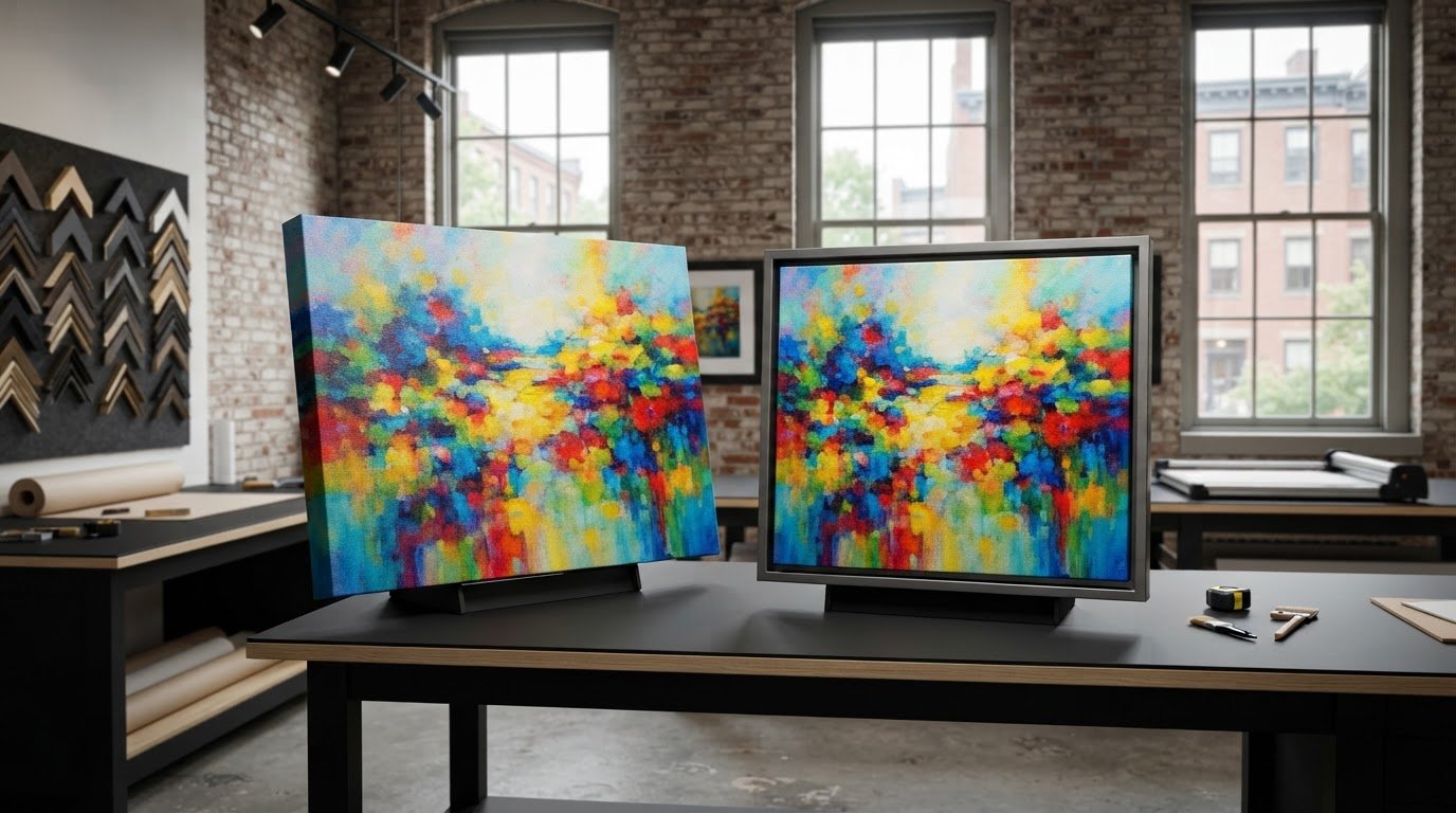
Paper and canvas don’t emit light, so neither can reproduce the glow of a backlit screen. The surface also affects how you perceive the image: coated paper can show color differently from an uncoated surface, and canvas texture may affect the apparent detail or contrast. There isn’t one surface that will look the same for every image. Consider the artwork’s tones and texture when assessing a proof.
If the project and print workflow allow it, make a small proof before committing to a larger reproduction. Check key areas, including fine marks, midtones, and deep shadows, under consistent viewing light. A proof is most useful when it uses the same file preparation and intended surface as the final print; otherwise, it may not reflect the result you’re trying to evaluate. Judge it from a viewing distance appropriate to the finished size, since close inspection and normal viewing can reveal different qualities.
Planning a larger reproduction? The guide to large format fine art printing explains considerations around scale and presentation. For artwork that needs a considered capture-to-print workflow, Image-Tec’s BetterLight scanning and Giclée printing connect high-resolution artwork capture with fine art reproduction. Explore Image-Tec’s art reproduction services as you plan your next print.
When professional art reproduction can help resolve dark prints
If you’ve checked the display, export, and viewing conditions but still can’t explain the difference, the issue may begin earlier in the workflow. A digital file can only reproduce the information captured from the original artwork. If that capture has uneven lighting, glare, or limited tonal detail, repeatedly adjusting brightness may not restore what the file never recorded.
That’s one reason the question “why are my art prints coming out dark” doesn’t always have a printer-based answer. When the source file or reproduction process needs closer attention, professional artwork capture and printing can help you assess each stage with the original art and intended print in view.
When the source artwork or digital capture needs attention
Capture quality influences the image that later gets edited and printed. If the digital file doesn’t preserve the artwork’s subtle tones, color relationships, or shadow detail, edits may improve one area while compromising another. BetterLight scanning is Image-Tec’s high-resolution art reproduction service, creating a digital source for the next steps in the workflow.
For a reproduction project, it helps to consider capture and print together rather than treating them as unrelated tasks. Image-Tec is based in Methuen, Massachusetts, and provides a local resource for artists working through capture-to-print differences. If presentation is part of the project, the guide to custom art framing and Giclée printing offers relevant context.
Plan a more controlled reproduction workflow
A considered workflow starts with the original artwork, creates a high-resolution digital file, and carries that source into print production. Reviewing the file and finished print as connected stages can make it easier to identify whether a mismatch begins with capture, image preparation, or printing. It also gives you a clearer basis for deciding what to adjust next.
Image-Tec produces fine art and canvas prints up to 60 inches wide. That range can support projects from smaller reproductions to larger pieces, with the final scale and surface forming part of the planning. A print’s appearance still depends on the artwork, file, materials, and viewing conditions, so a professional workflow is not a promise of an exact screen match.
For a closer look at reproduction options, explore Image-Tec’s art reproduction printing services. If you’re planning a project and want to understand how capture and printing can fit together, explore Image-Tec’s art reproduction services.
Make your next print a more informed one
Before preparing another version, write down what you want the finished artwork to retain: open shadows, gentle midtones, a particular color relationship, or another quality that matters to the piece. That simple reference gives you a clearer basis for reviewing the next proof than relying on memory of how the image looked on screen.
If you’re still asking “why are my art prints coming out dark” after checking the file and how you view the print, consider stepping back from repeated edits. A fresh review of the artwork, digital source, and intended print can help clarify which part of the reproduction process needs attention. The aim isn’t to make paper behave like a display, but to make considered choices for the artwork and its final presentation.
Image-Tec is an independent art reproduction studio in Methuen, Massachusetts, offering BetterLight scanning and fine art and canvas printing up to 60 inches wide. Explore Image-Tec’s art reproduction and Giclée printing services as you plan your next piece. With a clear reference and a thoughtful workflow, you can approach the next print with greater confidence.
Frequently Asked Questions
Can a bright monitor make my art prints look darker?
Yes. If your monitor’s brightness is high, an image can look lighter on screen than its tones will appear in a print. Before editing, lower the display to a comfortable setting and compare the image with a print under steady room light. For a useful check, compare recognizable details, such as a pale highlight or dark fabric, rather than relying only on the overall impression.
Why are the shadows in my art print darker than they look on screen?
Shadow detail can disappear even when the print’s overall brightness seems close to the screen image. If dark tones that looked separate on screen merge together in print, inspect those areas in the file at normal and enlarged views. Check whether the details are present before printing. If they are, the issue may relate to how those tones are being reproduced rather than a need to brighten every part of the image.
Does paper or canvas affect how dark an art print looks?
Yes. Paper and canvas reflect light differently, and their surface characteristics can influence how you perceive contrast, color, and fine detail. A smooth, coated surface may present the image differently from a textured canvas, but there’s no universal rule that one will always look brighter. If you’re choosing a surface, consider how its appearance suits the artwork and assess a proof on the intended material when possible.
Should I brighten my entire image before printing again?
Not until you know which tones need correction. If the shadows are the only area losing detail, brightening the whole image can make highlights or midtones look washed out. Keep an untouched copy of the original, then make a separate version with a selective adjustment to the affected tones. Compare the revised file with the original under consistent conditions before preparing another print.
Can the same digital file look different when printed by different workflows?
Yes. The file’s color profile, export settings, printer setup, and chosen media can all contribute to differences in the result. For example, the same artwork sent as two exports may be interpreted differently if their profile handling differs. A print on canvas can also appear unlike one on paper. To compare workflows fairly, keep the source file consistent and note the settings and material used for each version.
Should I judge an art print beside my computer screen?
You can compare them nearby, but don’t treat the side-by-side view as a definitive match. The screen produces its own light, while the print is illuminated by the room, so their brightness can shift differently with changes in ambient light. Instead, view the print under even, neutral lighting and look at the screen at a comfortable setting. Compare specific tones, then reassess the print in its intended display environment.
Can artwork scanning affect the brightness of a reproduction?
Yes. A scan becomes the digital source for editing and printing, so capture that misses subtle tonal information can limit what the final reproduction can show. A high-resolution scan can provide a detailed source file for the workflow. Image-Tec provides BetterLight scanning for art reproduction in Methuen, serving artists in the surrounding area who need an original artwork captured for reproduction.




Leave A Comment
You must be logged in to post a comment.